CREATE INSTANT CUSTOMER + MARKET MAPS
- How To Guide /
- CREATE INSTANT CUSTOMER + MARKET MAPS
When it comes to reaching your audience, precision is key. You need to analyze your customers and locations in a flash to craft spot-on marketing strategies. And let’s be real—you need to be sure you’re hitting the right folks so you’re not burning money and effort in the wrong places.
But identifying high-potential areas that match your target audience perfectly? That’s tough. Sifting through data, spotting target markets, and tailoring campaigns can drain time and energy, making some efforts fall flat.
What you need is a system that visualizes your locations and customers in an instant. You need to analyze your customers in minutes rather than days or weeks.
Instantly spot customer hotspots on your map, catch regional trends, and visualize different customer segments. Enhance everything with demographic data, and you’ve got a secret weapon ensuring you reach the right audience with the right message.
And here’s the kicker: flag underperforming areas in real-time, keeping you in the loop with your customer base. Track engagement, purchasing behavior, and satisfaction in real-time, and you’ve unlocked a new marketing superpower: creating custom campaigns that blow sales out of the water every time!
Let’s get started building your first customer and market map. Trust us, you don’t want to miss this!
CREATE YOUR MAP
Here’s how to whip up a new map of your customers and target markets in no time.
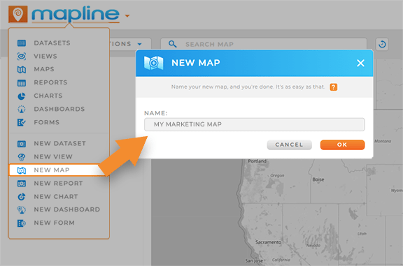
Create a new map and import your business locations and customer locations from an existing dataset in Mapline.
Alternatively, you can upload locations directly from a spreadsheet. Click the ADD menu in the top left-hand corner of your map, hover your mouse over PINS, and click FROM SPREADSHEET. Simply paste your spreadsheet data, and you’re all set!
With your map foundation set, it’s time to unleash its full potential for customer insights.

Pro Tip: Map bulk locations to quickly visualize new leads, competitors, or upcoming events! This creates a comprehensive overview of all the factors impacting your campaigns, empowering you to pivot and fine-tune your approach on demand.
CUSTOMIZE YOUR MAP
Next, let’s set up your map to ensure you always see the metrics that matter most. One of the best ways to achieve this is with customer segmentation and demographic data. This sets the foundation for the kind of advanced analytics every marketing manager dreams of.
CONFIGURE YOUR DATASET
Let’s ensure your dataset includes the info you want to see on your map. This way, you’ll have the ability to segment your audience based on their preferences and purchase behavior later on.
Right-click your map pin layer and select VIEW DATA. Your dataset will open right there, so no need to navigate away from your map.
Double-check that your dataset includes key info like:
- Revenue by location
- Average order value
- ROI by customer
- Product preferences
- Customer lifetime value
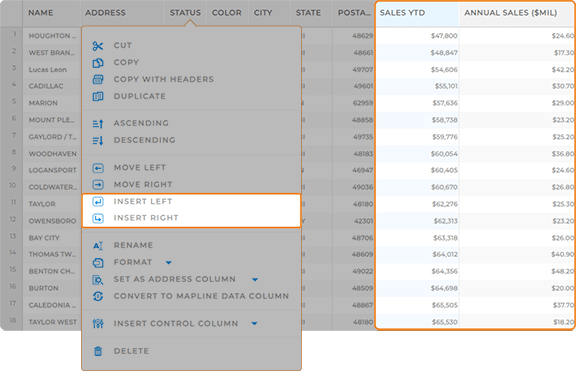
To add a new column, simply right-click any column and select INSERT LEFT or INSERT RIGHT. If you’re using multiple datasets (e.g., locations vs. customer data), repeat this step as needed.
Or, to quickly calculate some of these metrics, leverage Mapline Data to run formulas in moments.

Pro Tip: Ensure that your data always updates in real-time. Automate your data collection and eliminate tedious data entry and reporting processes. What an incredible way to access up-to-date insights 24/7!
SEGMENT YOUR AUDIENCE
Visualize key customer segments to analyze the factors impacting behavior and sales. This is a powerful way to quickly hone in on trends for specific segments, driving informed business decisions.
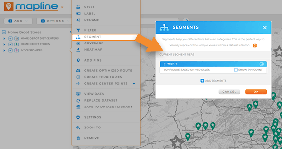
Click the map pin layer with your customer data and select SEGMENT. onfigure your segments to display the customer categories that matter most to you. Add as many segments as you want, then click OK.
Now, your map showcases all your customer segments! Use the map sidebar to toggle them on and off to compare and contrast your data. That’s some serious power, right there!

Pro Tip: Integrate your systems with Mapline via our API and Connectors. This is a powerful way to seamlessly exchange data between your programs and ours, ensuring real-time insights that power data-driven decision-making.
ENHANCE WITH DEMOGRAPHICS
But that’s not all! Dive even deeper when you add demographic data to your map in seconds. Discover regions with untapped potential and pinpoint where to focus your campaign efforts—all with a few clicks!
Adding demographic data means adding a new column to your dataset. This is the secret sauce that lets you do more with your data, like analyzing the population within a certain mile radius of your stores.
Open your dataset, click the MAPLINE DATA icon in the top menu, name your new column, and select U.S. DEMOGRAPHIC DATA as the source. Choose from the following options:
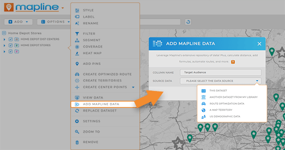
- Population: The total number of individuals living in a specific geographic area, segmented by voting age, ethnicity, gender, race, or all of the above.
- Number of Households: The total number of separate living spaces of families within a given area, segmented by family size, family type, householder age, householder ethnicity, householder race, children present, or all of the above.
- Average Household Income: The average income for households within a designated area, segmented by income type.
- Number of Dwellings: The total number of occupied or vacant dwellings in an area, segmented by householder age, householder race, householder ethnicity, or all of the above.
Click OK, and a new Mapline Data column will appear in your dataset. This might take a few minutes, so in the meantime, let’s put your data to work!

Pro Tip: Mapline offers the latest demographic data available from Uncle Sam, ensuring rich analysis with the most recent information.
PUT YOUR DATA TO WORK
You’ve created a powerful map, but now it’s time for the fun part—diving into the insights that’ll make a real impact on sales. Let’s uncover the key insights hidden in your data. These steps set the stage for you to drive data-informed decisions and maximize ROI at your organization!
VISUALIZE SALES DENSITY
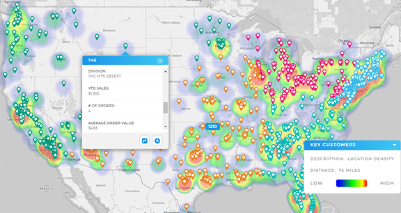
Quickly visualize sales density around each location! A heat map helps you and your team understand your business on a deeper level.
In your map sidebar, click the pin layer and select HEAT MAP. Adjust your heat map settings to reflect your desired look and feel, then click OK.
Now, you’ve got a stunning heat map showing sales density around your locations—perfect for presentations, proposals, and reports.
MAP COVERAGE AREAS
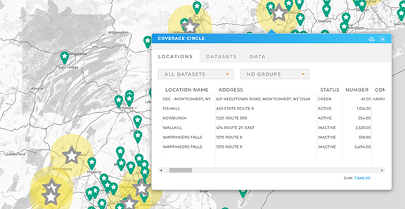
Visualize coverage around your locations to identify how much of your target market falls within your service areas, visualize campaign reach, or see how much ground your sales teams can cover.
Click your pin layer folder and select COVERAGE. Customize your coverage area settings, then click OK.
Circles will appear on your map, showing the radius around your pins. Save these circles to a new or existing map folder to treat them as territories and dig deeper into your data.
