
Visualize Trends and Patterns in Your Data
- How To Guide
- Visualize Trends and Patterns in Your Data
As a marketer, you’re on a mission to reach the right customers with the right message so you can skyrocket your ROI. Yet too often, your team is bogged down with manual data entry, struggling to see trends, and spending too much time on reporting.
But what if you had a secret weapon? A way to instantly visualize trends and patterns in your data, perform advanced calculations, and analyze audience demographics without breaking a sweat?
Keep everything in one place and empower yourself to see the big picture so you can make data-driven decisions that propel your business forward. Then, instantly identify trends and patterns with geo-aware charts, reports, and dashboards. Then, adjust your strategies promptly based on real-time performance metrics.
So, are you ready to take your data visualization to the next level? Here’s how to get started.
KEEP EVERYTHING IN ONE PLACE
Say goodbye to scattered data and hello to streamlined efficiency. Consolidate all your business information in one place for a cohesive view of your operations. This makes it easy to access and manage your information, making it simple to share with stakeholders and keep everyone on the same page.
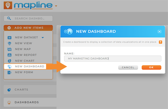
Then, create a new dashboard where you can keep all of your visualizations and metrics in one place! From the homepage in Mapline, click the ADD menu and select NEW DASHBOARD. Name your dashboard, then click OK.
From here, we’ll customize your dashboard by adding different elements that empower you to keep track of all of your marketing tasks and KPIs in real-time.

Pro Tip: Mapline’s API and Connectors make it possible to push and pull data between your systems and ours. Ensure seamless access to up-to-date information and eliminate the inefficiencies and errors that come from manual data entry. Say goodbye to data silos and hello to a unified, coherent view of your business operations.
TRACK SALES GROWTH BY REGION
Track your sales growth in real-time! Get up-to-date insights on sales performance across all of your business locations, and understand the impact of regional trends on your bottom line.
Here are two powerful ways brands get the in-depth insights they need to track sales and grow faster than ever.
VISUALIZE SALES BY REGION
Leverage your customer market map to visualize sales trends across different regions. First ensure that your business location dataset includes sales data and the region divisions you’d like to visualize.
With your dashboard open, click the ADD menu, hover over MAP, and select FROM MAP LIBRARY. Choose your business location map, and click OK.
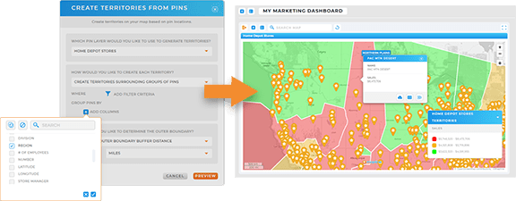
Your map will appear on your dashboard. Next, click the ADD menu in your map, hover over TERRITORIES, and select FROM EXISTING PINS. Select your source dataset, then select CREATE TERRITORIES SURROUNDING GROUPS OF PINS.
Under GROUP PINS BY, select the dataset column by which you’d like to group your pins–for example, region or division. Configure your outer boundary settings, then click PREVIEW.
If your boundaries look correct, click SAVE.
Now, you have a map of regional boundaries around your business locations! From here, you can use Mapline Data to add a sum of sales for each region, then leverage dynamic territory styling to color-code your map territories as an interactive heat map displaying sales performance by region. This is a great way to visualize high-performing versus low-performing regions so you can pinpoint ideal areas of focus.
CHART SALES BY CAMPAIGN
Alternatively, create an interactive chart that empowers you to hone in on the sales data you need to see. First, ensure your sales dataset includes relevant campaign information, such as the campaign name, platform, cost, month and year, or any other relevant data you intend to track in your chart.
Then, with your dashboard open, click the ADD menu and select NEW CHART.
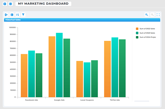
From here, you can customize your chart by clicking and dragging the dataset columns you want to visualize. For example, to visualize sales by campaign, drag the CAMPAIGN NAME column to your X-axis, then drag the SALES column to your Y-axis.
You can even segment your chart by region to visualize sales by campaign and area. Isn’t that incredible?

Pro Tip: Auto-import your ad campaign performance data directly into Mapline! Leverage our API and Connectors to get real-time updates from Google Adwords, social media ads, MailChimp, or any other marketing channel you want to track. This is a powerful way to stay on top of your ongoing campaigns and local targeting.
MONITOR AD CAMPAIGNS BY ZIP CODE
Monitor your ad campaigns in real-time and understand where your highest-converting customers are purchasing from. If you run ad campaigns by zip code, you’re going to want to check this out!
First, create a new map and import your ad performance dataset. Ensure that your dataset lists sales data by zip code so you can get the best regional insights.
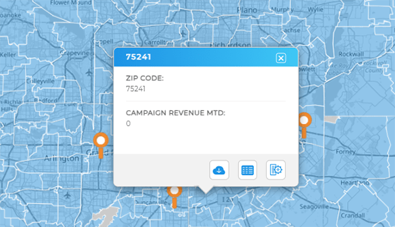
Once your sales data is on the map, it’s time to add your zip code boundaries! Click the ADD menu, hover over TERRITORIES, and select FROM MAPLINE’S REPOSITORY. Type U.S. ZIP CODES into the searchbar and select U.S. ZIP CODES- ALL STATES.
Select your preferred color styling, then click OK.
Now, you have a map displaying sales performance by location, which you can compare and contrast with your ongoing campaigns. From here, you can filter your data to view specific ad campaigns or performance metrics, or segment your business locations to visualize which areas have the highest engagement or sales conversions.

Pro Tip: Layer different ad campaigns on the same map to compare their effectiveness in various zip codes. Toggle your map layers on and off to compare and contrast. How cool is that?
ANALYZE SEASONAL SALES TRENDS
Analyze month-over-month sales to learn how different seasons impact revenue. This is a powerful way to understand your audience and which seasonal promotions you should focus on.
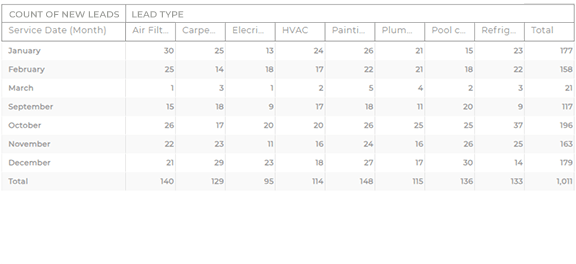
From your dashboard, click the ADD menu and select NEW REPORT. Name your report and click and drag the dataset columns you’d like to visualize into the report fields. For example, add your MONTH column to the REPORT COLUMNS field, and add your SALES column to the REPORT CALCULATIONS field. This column will default to a count of sales, but you can click the blue arrow next to the sales column and select CALCULATION to change it to SUM of sales.
When you’re done, click OK. Now, your report is visible on your dashboard, and you can see the seasonal sales data you need on demand. Isn’t that awesome?
PUT YOUR DATA TO WORK
Now, your dashboard is ready to empower you to do more with your data. Here are some powerful ways to put your data to work and transform your marketing management:
- Craft location-driven marketing campaigns that adapt to local conditions
- Analyze competitors and market footprints and stay ahead of the competition
- Nurture customer relationships with satisfaction reporting and automated communications


